KUMOYAMA
Concept, design, art direction
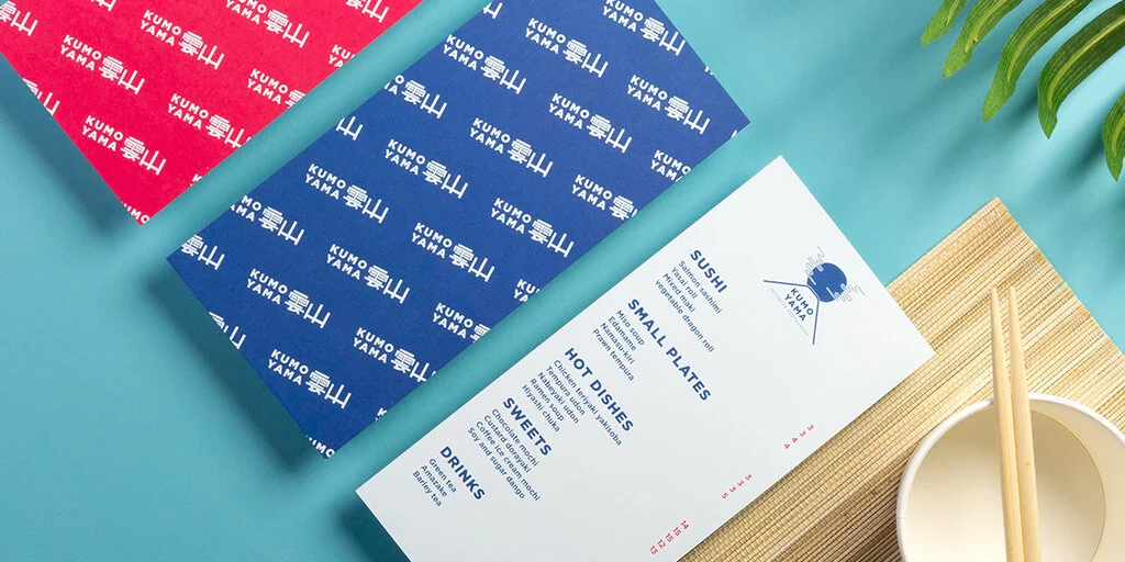
The brief was to design a fictional brand identity that could be applied to MOO products, showing their versatility as well as inspiring the MOO social community. These assets were shown across social channels and email. I developed the branding for a Japanese restaurant based in the UK. The concept focuses on taking inspiration from aspects of traditional Japanese art and symbolism and re-imagining it with a contemporary twist. The name of the restaurant KUMOYAMA translates as Cloud Mountain which reflects the illustrated logo icon. Products include business cards, stickers, flyers and postcards.
Team:
copy - Ed Ross
photography - Rob Wilson, Tais Sirote
artwork - Jemal Mustafa